WHO AM I



Description
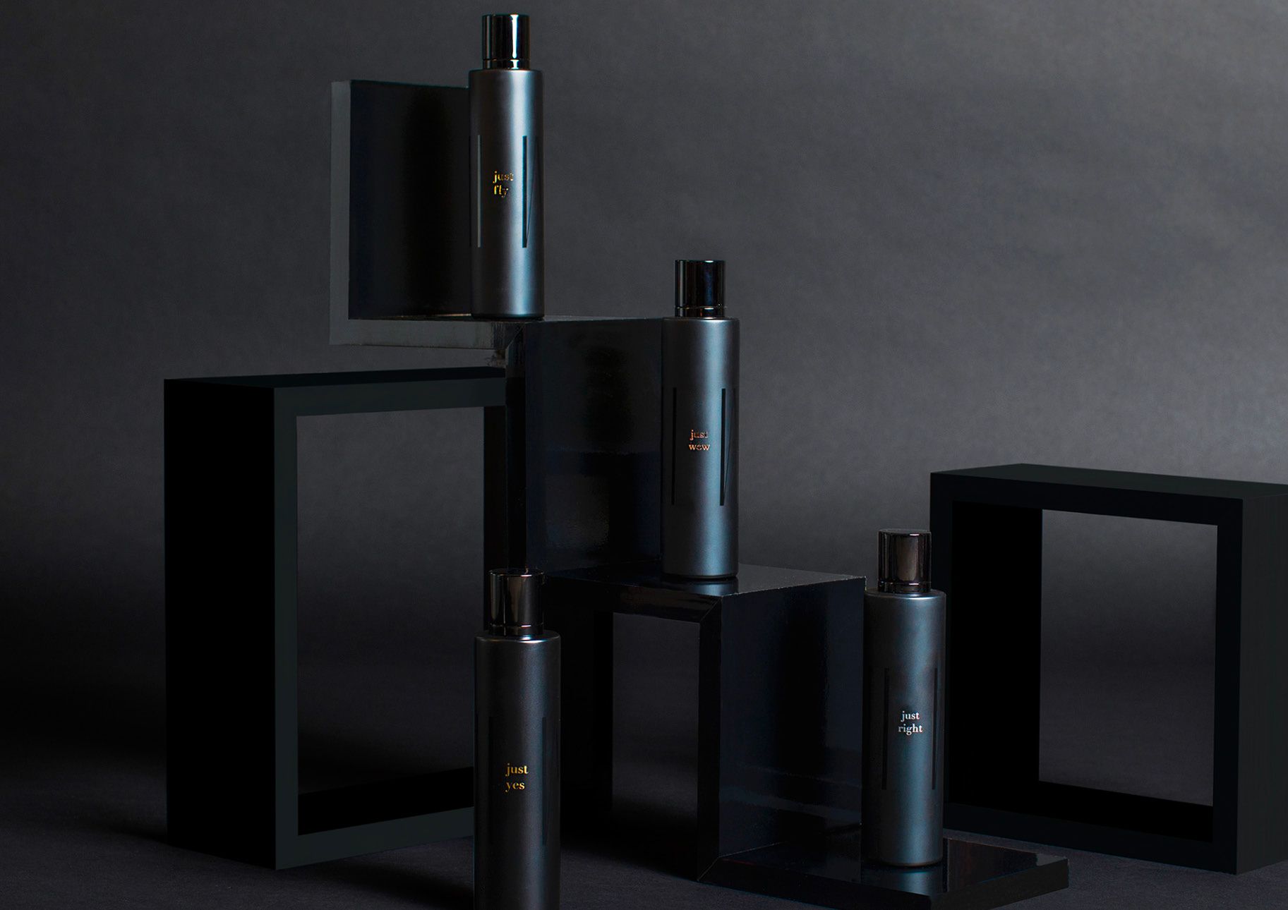
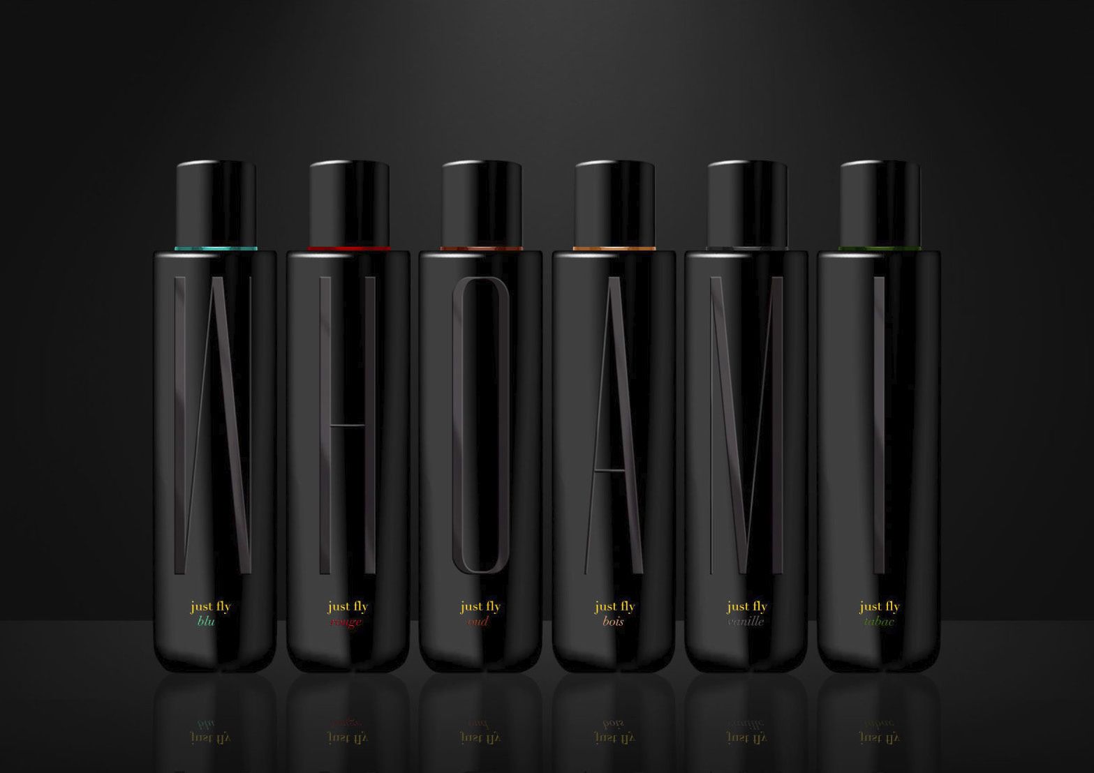
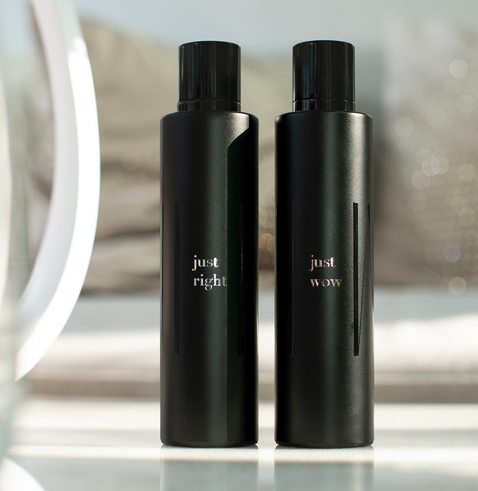
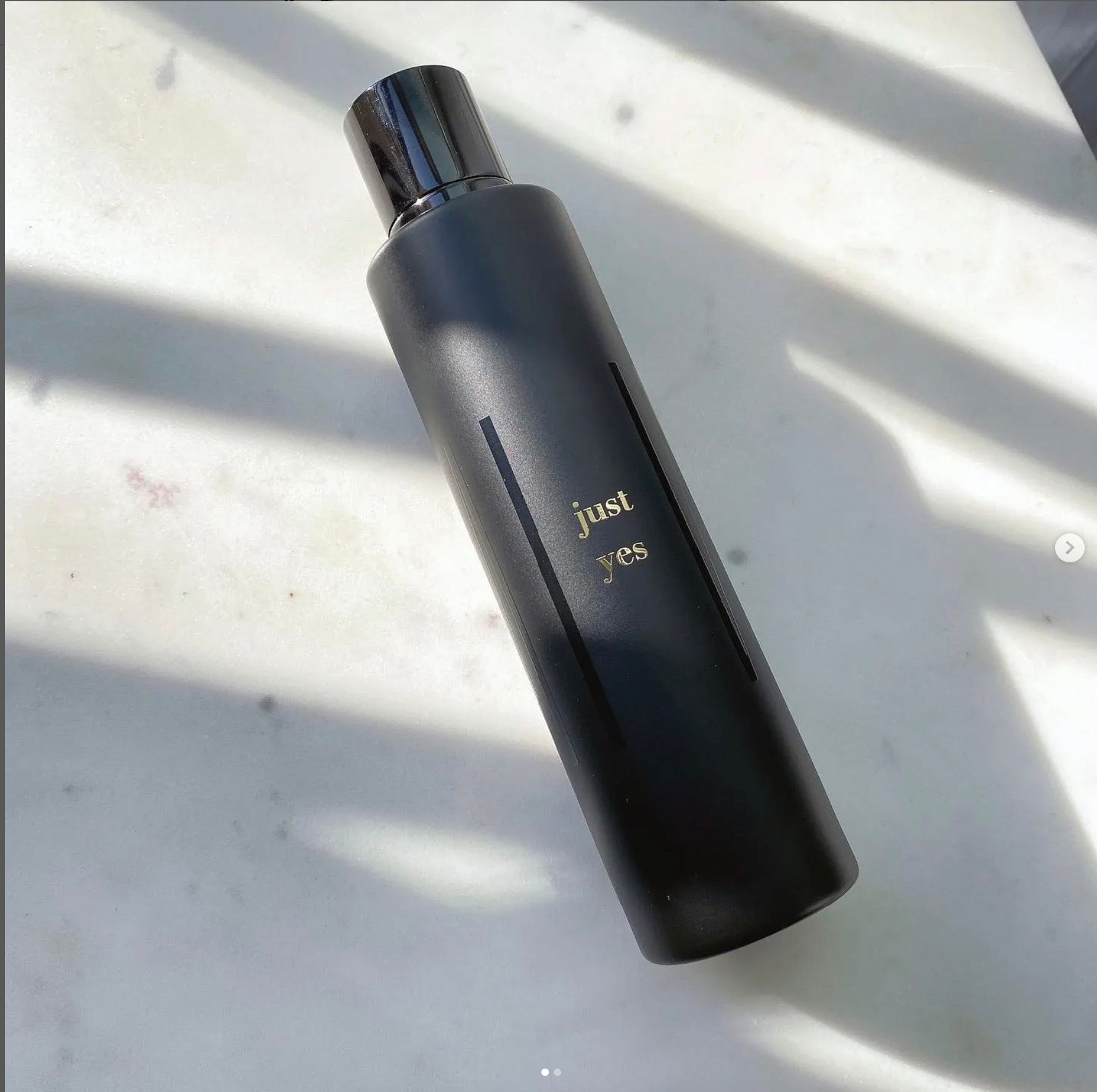
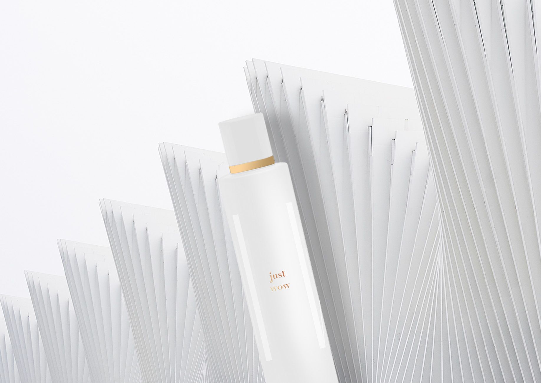
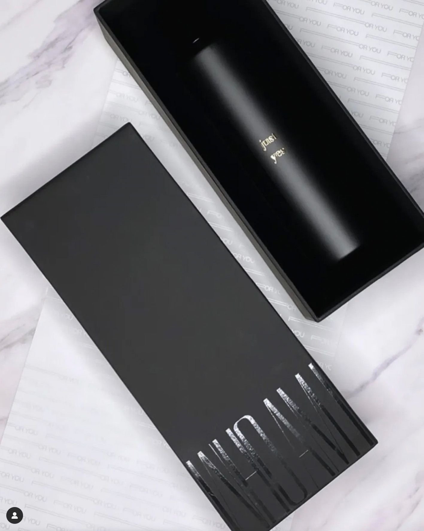
WHO AM I is an identity built as a provocation—and then refined into a system. Not a slogan, not a “story”: a question placed on the object with the seriousness of a monogram. The brand language is deliberate: tall, elongated letterforms stretched across lacquer-black cylinders, as if the name itself were architecture. The packaging doesn’t decorate the product; it claims it. Black on black, gloss against matte, depth over noise—so the first impression is silence, and the second is impact. The concept lives in contrasts that feel human rather than trendy: discipline and instinct, restraint and seduction, the private ritual and the public gaze. A wild horse, a gold-lit eyelid, a black shoreline under a low sky—these aren’t “mood boards.” They are cues for a world where elegance has tension, not sweetness. Even the naming follows that philosophy: short, affirmative phrases—just yes, just right, just wow—reduced to the emotional minimum, like decisions made without apology. Visually, the range is held together by an almost industrial logic: repetition, alignment, and a controlled use of colour as a functional code—thin rings, small accents, never a palette explosion. The objects are photographed like design pieces, not cosmetics: reflections, hard light, mirrored planes, and negative space that feels expensive because it is confident. WHO AM I is, in essence, a brand that treats identity as a material—something you can hold, rotate, and recognise in the dark. It doesn’t ask for attention. It earns it by being uncompromisingly composed.
Client
GS
Category
CONSUMER BRANDS
Year
2024