UNIQO
Description
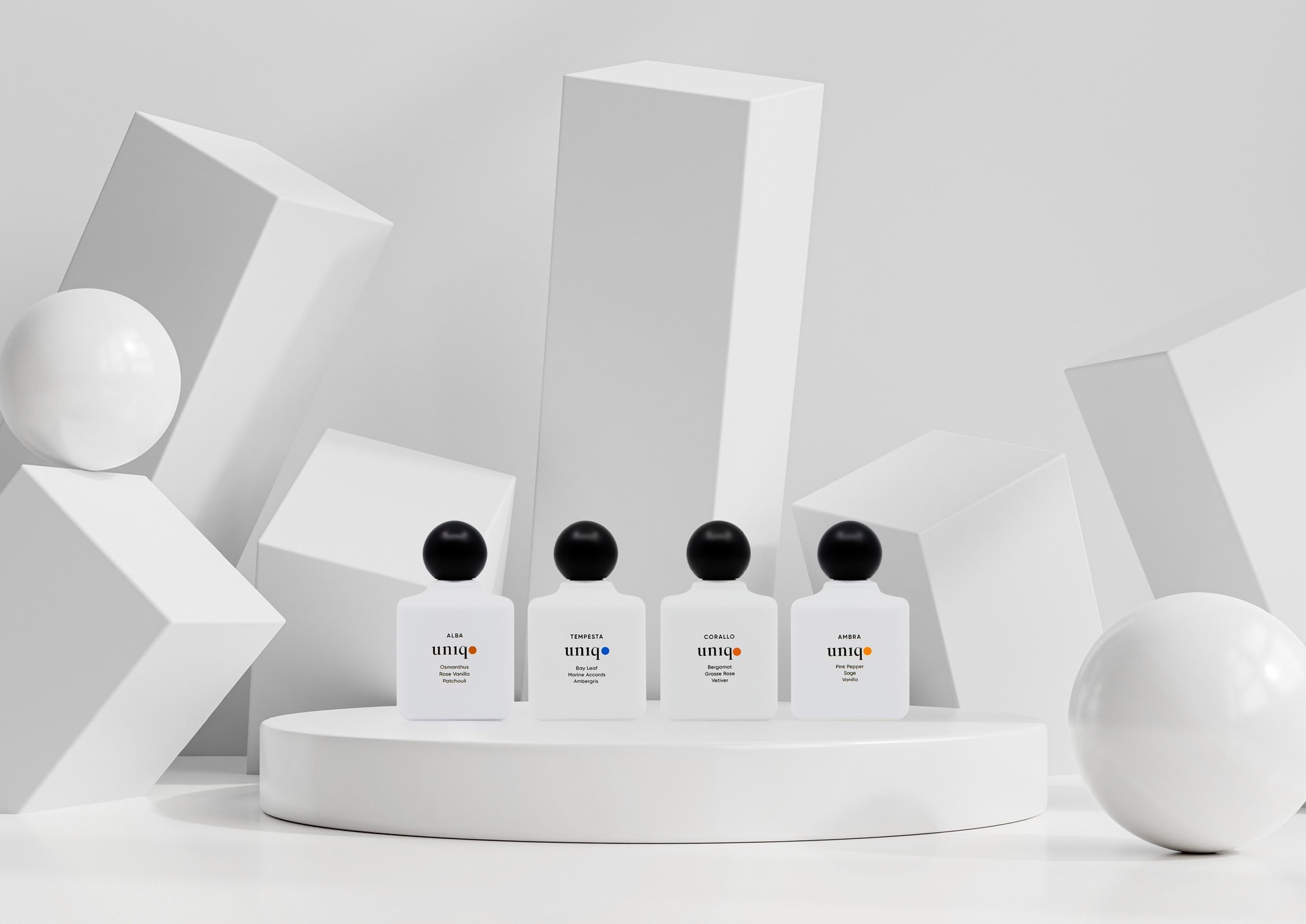
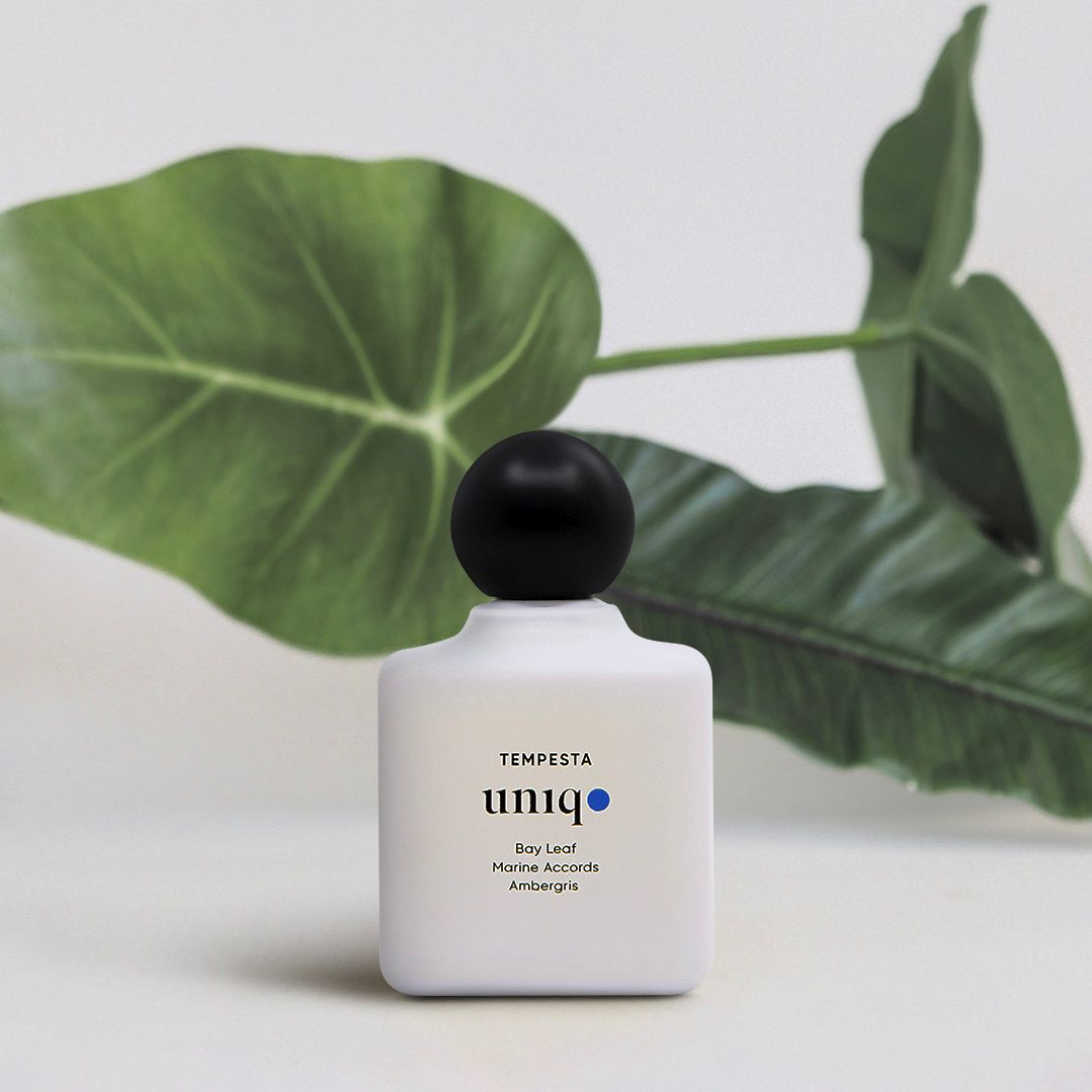
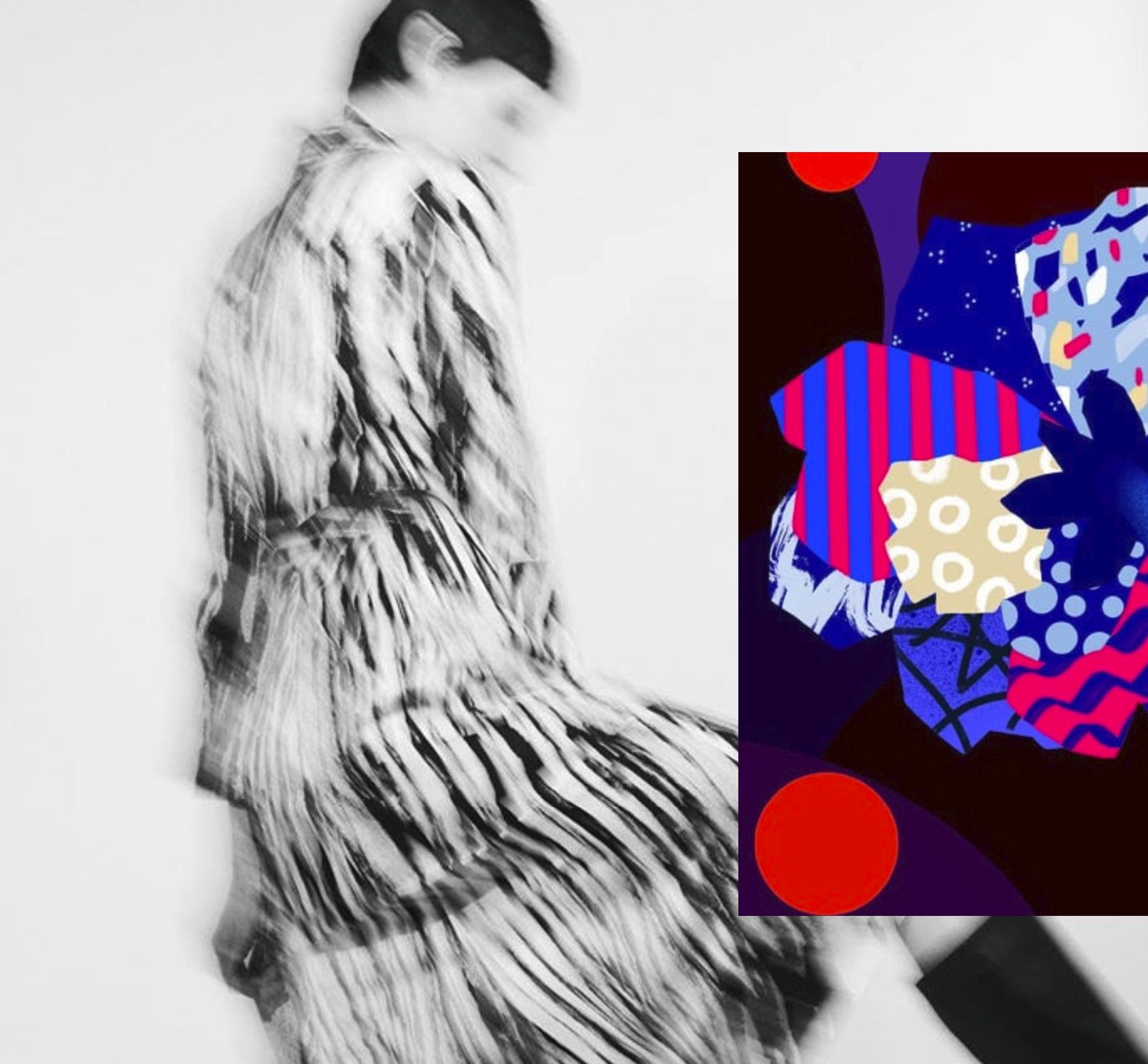
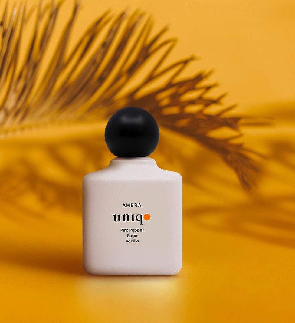
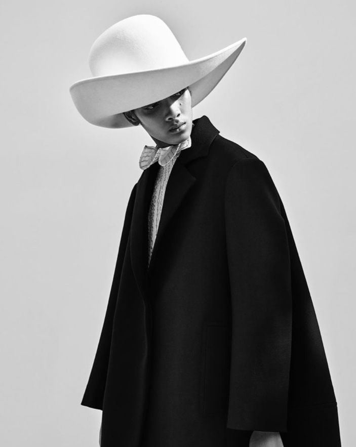
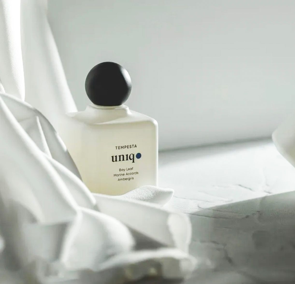
UNIQO is a fragrance project built on a simple conviction: if the object is resolved, the brand doesn’t need to shout. The name comes from the Italian unico—not “different” as a pose, but singular as a standard. Everything that followed was designed to protect that standard across an entire system: naming, range architecture, identity, packaging, and image language. The visual world is deliberately restrained. Classical typography is treated with respect, then interrupted by one modern decision: a single coloured dot that acts as punctuation, navigation, and memory anchor. It is not decoration. It is the smallest possible signature that can carry a collection—one precise chromatic mark per scent, consistent enough to scale, specific enough to stay human. Around it, the hierarchy is quiet and exact: proportions, spacing, and legibility doing the heavy lifting. The bottle is conceived as an object first, product second—matte, milky, opaque; capped with a black sphere that reads like a seal. That contrast is intentional: softness against certainty, tactility against geometry. The packaging follows the same discipline: structured, minimal, and engineered for repetition without fatigue. The system is not precious; it is rigorous—meant to survive new launches, new markets, and new formats without losing its centre. The imagery extends the same logic. Rather than “lifestyle,” UNIQO lives in controlled still life: light, surface, volume, and negative space. The sets borrow from modernist sculpture and quiet gallery rooms—objects placed with care, colour introduced with restraint, and atmosphere built through material rather than effects. The brand language leaves room for the fragrance itself; the design never competes with the scent, it frames it. UNIQO becomes recognisable not through noise, but through discipline—an identity that earns attention by refusing to beg for it.
Client
GS
Category
Parfume
Year
2022