KLINICA




Description
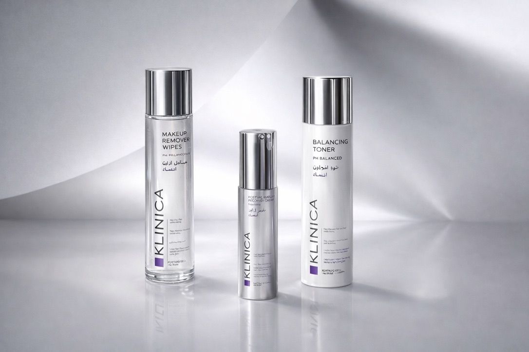
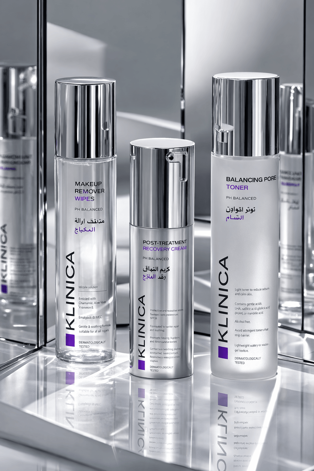
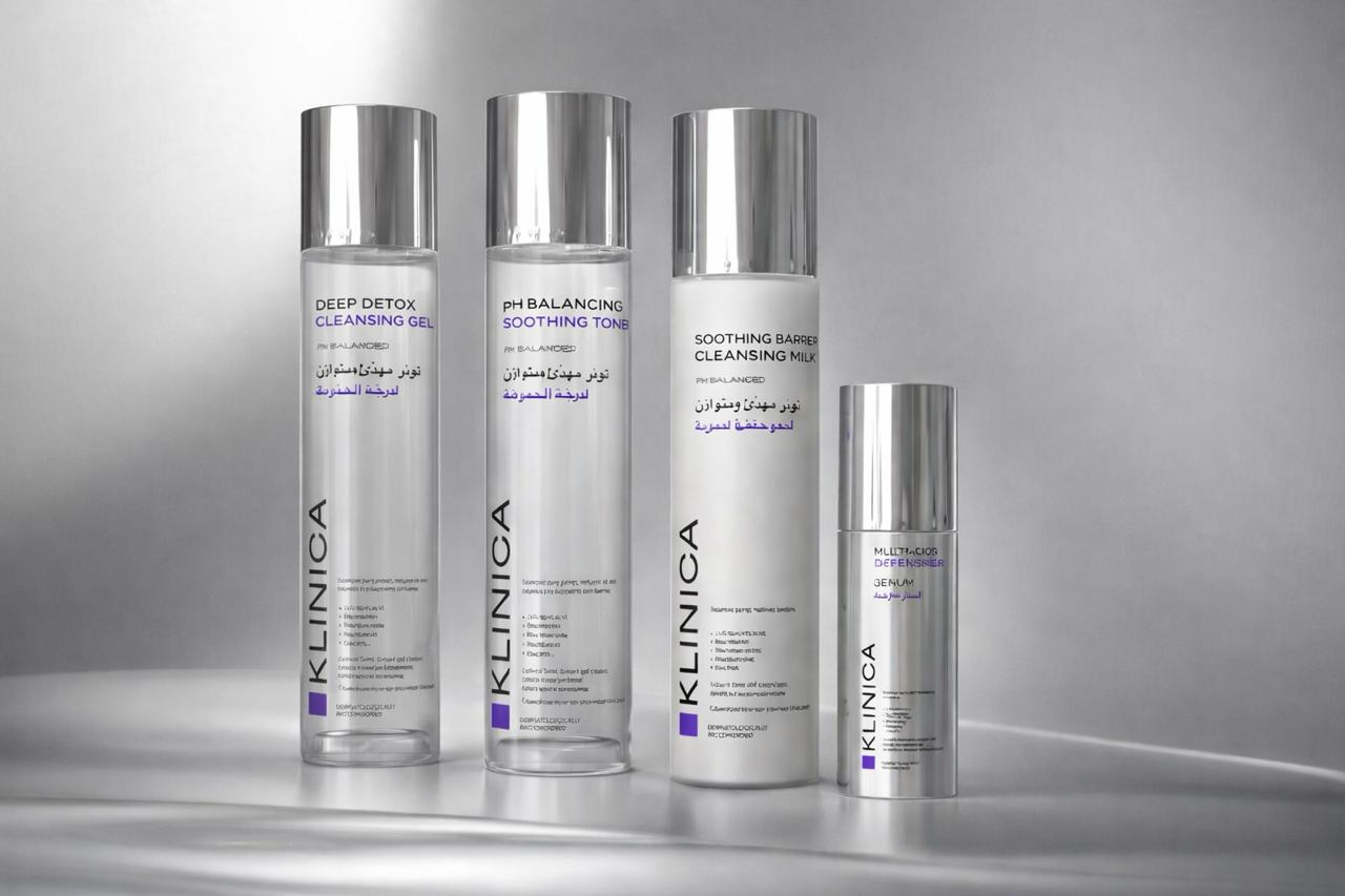
KLINICA is a skincare identity built on a deliberate tension: the authority of the clinic and the intimacy of daily care. The name announces the positioning without apology—efficacy first—and the design keeps that promise. Nothing decorative, nothing vague: a brand that behaves like a well-written prescription, clear in dosage, confident in effect. The system is organised around colour as function. Each line owns a single, saturated field—deep violet, clinical blue, botanical green—applied to tubes, jars and bottles with pharmaceutical flatness. Against it, typography stays white, compact and exact, set like labelling rather than styling: name, function, ritual. The result reads at arm's length in a bathroom cabinet and from across a shelf in retail—recognition before reading. Materials and photography follow the same discipline. Matte tubes and dense glass jars are staged on trays, marble and clean ceramic—surfaces borrowed from the laboratory and the spa in equal measure. Macro botanicals appear as evidence, not mood: the ingredient shown the way a chart shows data. Skin, when it appears, is real and lit simply, keeping the brand on the side of dermatology rather than glamour. In essence, KLINICA translates trust into form. It borrows the codes of the pharmacy—order, legibility, restraint—and warms them just enough to live in the home. A skincare brand that doesn't promise miracles: it presents protocols, and lets precision do the persuading.
Category
CONSUMER BRANDS
Year
2025