Al-Turāth
Description
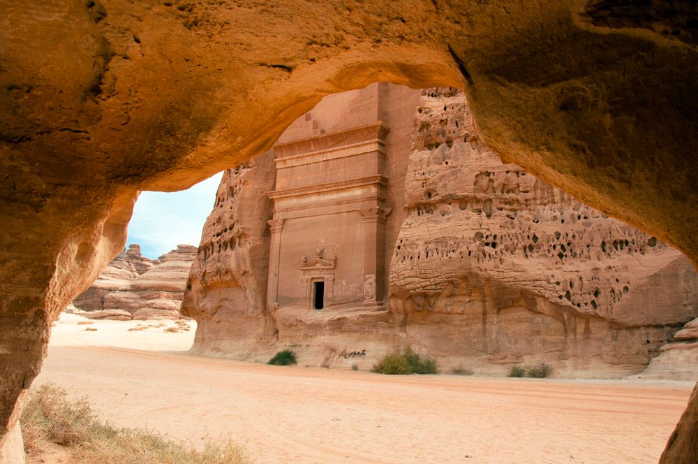
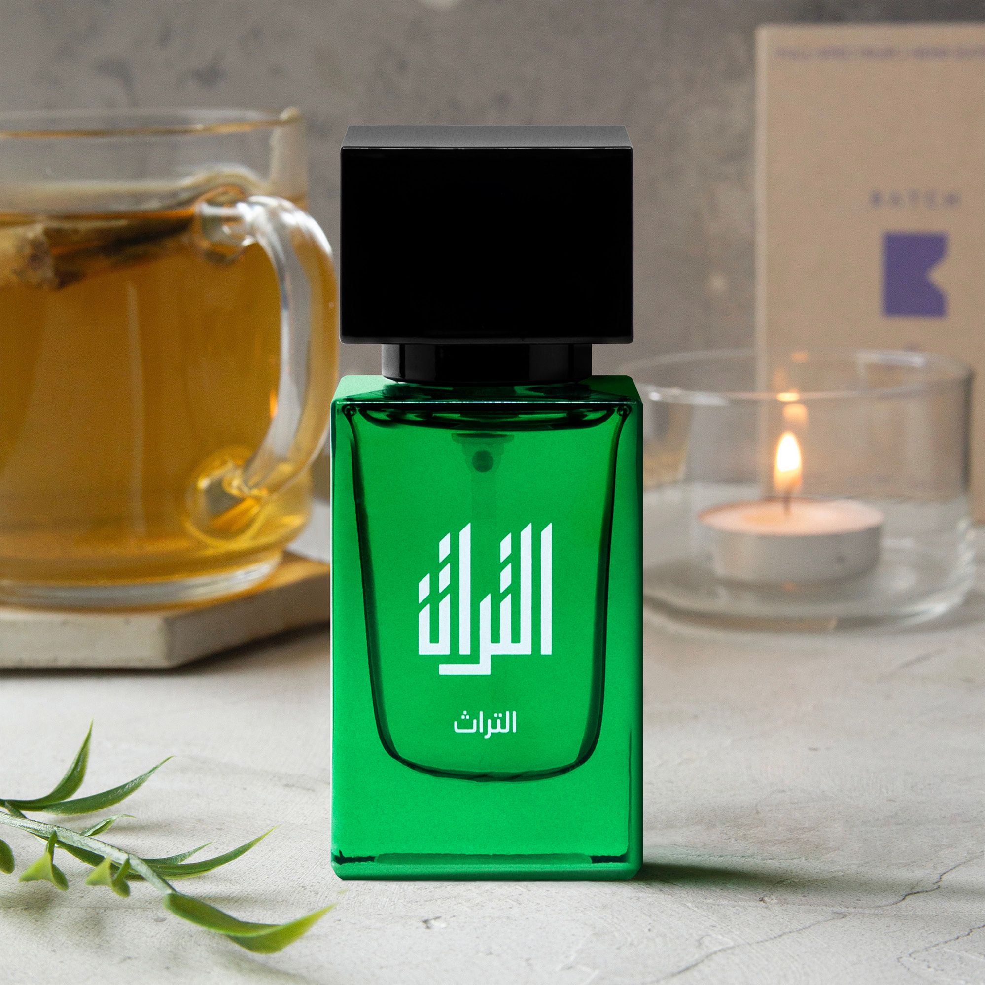
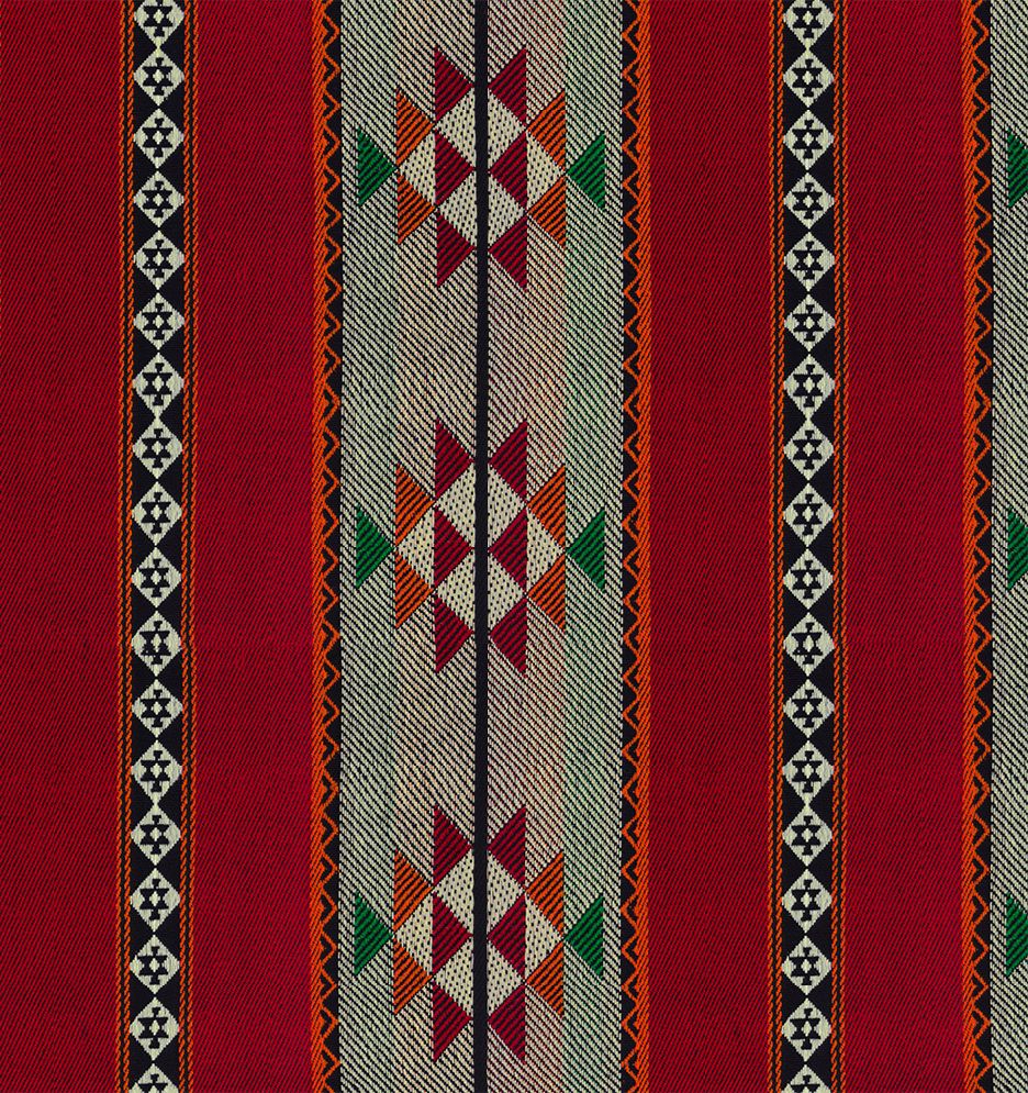
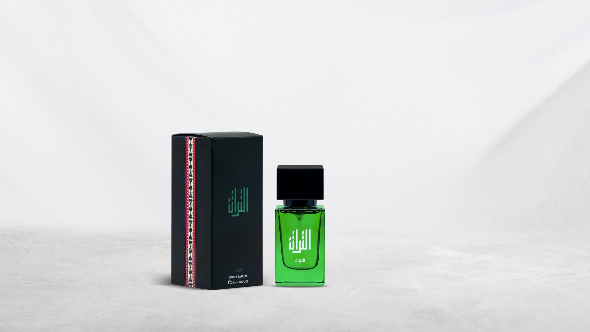
This Saudi National Day project was conceived as a gesture of respect, not a souvenir. A celebratory object, but with the restraint and seriousness that national symbolism demands. The concept centred on two words set as anchors: الملك (The King / The Kingdom) and التراث (Heritage). Not as decoration, but as meaning—heritage as continuity, and sovereignty as structure. Together they form a compact statement: identity preserved, identity carried forward. The design language is intentionally minimal so the cultural elements can hold their weight. A deep, vivid green—immediately legible as national colour—becomes the primary field, treated almost like stained glass: luminous, dignified, and unmistakable. The typography is not “styled Arabic”; it is composed Arabic—built with architectural balance and confident negative space, allowing the script to read as a mark, not an ornament. Around it, everything is quiet: a black cap like a seal, a clean bottle geometry, and a disciplined layout that protects legibility. The packaging introduces a second register: a vertical band of traditional patterning, used with restraint—placed like a ceremonial textile rather than spread as a motif. This is the project’s key tension: modern product clarity paired with heritage detail, each one kept in its proper place. The result is contemporary without being generic, and culturally specific without becoming costume. Photographically, the world sits in warm, human rituals—tea, light, stone, textile—so the object feels at home in daily life, not isolated in propaganda. It reads as a modern commemorative piece: respectful, grounded, and designed to be kept. A celebration that doesn’t rely on noise—only on symbols treated with care.
Client
GS
Category
CONSUMER BRANDS